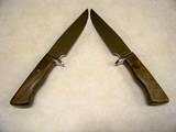
All, I have been making knives for almost 3 yr. and I just can not find it in me to make a pretty knife, I'm not sure if it comes with years of making knives or if it is natural. I think I make a good knife but what is your input on making a pretty knife? would it be the finger guard design or spacers or handle material or ALL the above, I don't have a lot of $ to spend of the finer tools and High $ handle material so I do my best with what I have. This is a pair of knives I just posted in the gallery, Let me know what would make this a better Looking knife
Thanks Dana
Dana Holman
Apprentice Smith
Dana,
That's a hard question to answer directly. First of all, you have to start with good basic design and build on that. Beautiful materials do help, but they cannot make up for poor design or the makers ignoring subtle nuances of curve and flow that are well within the ability of the maker or the demensions of the material. In my opinion, you have discerned one of the things that set apart an experienced maker, one that has a good eye. Some knives, although being well built and solid users, dont have that eye grabbing "thing" that you are talking about. It's the rare maker that can consistantly nail that "thing".
I have experienced this. Having reached a point in the work in progress, I am stumped. For some reason, I am not liking it, at all. I then sit and look at the knife and ask myself, "what is it I dont like about it?" I try to narrow down to a particular line, which is usually what the problem is. I hold a piece of paper up against the part that I have decided is the problem area and hide part of it, in effect, changing the profile or line. I try A curve or MORE curve or LESS curve. I might even figure out that I'm concenrating on the wrong line, then proceed to eliminate the good things and narrow down things that might need tweaking.
I try to think about what it actually is that draws us to an object like a knife. It might function very well, but it dont have eye appeal. To make you keep looking, a knife has to evoke an emotional response. In the case of a pretty woman, you wont hear anyone say, "Hey, I sure like the way she functions". So, there is some correlation between what attracts us to people and what attracts us to knives and other art objects. Proportion, line, and flow play a part in both. You might liken the basic design to bone structure and line and flow to the "fleshed out" knife. A well made knife that catches everyone's eye, is not as simple as perhaps it seems. When you see a knife that, although it dont have a lot of bells and whistles, can still hold your attention, you can bet the maker has put a lot more thought into it than perhaps he gets credit for simply because most people are not capable of recognizing the details in line or flow or even knowing the exact reason they cant take their eye off it. I should say reasons, because there are many tiny, almost unrecognizable, details encompassed in the successful execution of a beautiful knife.
Thanks Lin, that's makes a lot of since. So in your opion on these two knives do you think I have the basic design? Let's take the blade, is the clip to far back on the spine and is the curve of the edge right. Does the handle style fit the blade style and finger guard. I think that is what I have trouble with putting a certain handle with the right configured blade and guard. I know everyone has their own style, I'm Just trying to find mine
thanks Dana
Dana Holman
Apprentice Smith
I agree with Lin, that's a hard question to answer. Like everything else, beauty is in the eye of the beholder. Expensive materials, engraving, filework and/or carving don't necessarily make a pretty knife. How everything fits, the flow of the knife, the finish all contribute to what catches the eye. I've seen some knives that were, for lack of a better word, "Plain", that just jumped out at me. They caught my eye and I couldn't look away. A few years ago Mike Williams had a small bowie on his table, at The Blade Show. It had a carbon steel blade and, if I remember correctly, an iron wood handle. No file work. No carving. No engraving. But, it was beautiful in it's simplcity. It was one of those knives that I couldn't stop looking at. Now, I wish I could tell you how to achieve that look, but I'm still striving for it. Once in a while I come close. Maybe someday I'll get there. I guess that's one of the reasons we keep doing this.
Dale
Dale Huckabee
Journeyman Smith
dalehuckabeeknives.weebly.com
Hello Dana. I have to go with Lin and Dale, hard question to give a definitive answer to. A lot of it comes with experience and looking at a lot of knives. I remember constantly studying the Knives Annuals and just looking at the knives. I guess some of it sunk in.
One of the main things is proportion. Does the handle fit the blade? A short blade and a long handle look kind of funny, same with a long blade and a short handle. Also a handle that is too thick or a guard that is too thick. On the two knives you posted today, it looks like the handle is overpowering the blade to me. Maybe just a little thinning down here and there and some contouring.
I like drawing pads and use them a lot. Trace the blade outline with the tang and then try different handle designs and guard designs. Some you will erase right away, others start you going hmm this looks good.
Basically it is a learning curve just like any other endeavor. I still say got to shows and look at knives in person to see how the handles are designed and how things flow together. For me the process is still ongoing.
Some people do seem to have a natural gift, but most of us have to learn it.
Keep up the good work.
Brion
Brion Tomberlin
Anvil Top Custom Knives
ABS Mastersmith
Hi Dana,
Wow, talk about a tough question, but a GREAT one. I think great questions are the kind that you can live into for a lifetime. I wonder the same kind of stuff too. Lin's description of part of how he processes by asking very specific questions as he "dialogs" with the knives he makes seems to hold a lot of wisdom in it. I had the good fortune of studying with him briefly for a weekend this summer at an ABS hammer-in in Maine. He exudes an unassuming manner of earnest application of attention, perception, inquiry and dialog. I believe your question is an effort of such striving.
JD Smith, another master smith at that hammer-in gave a remarkable workshop of knife design. It was unbelievable how much he packed into a couple of hours. I got enough ideas, information and inspiration to last me a good while yet. One of the things he talked about was developing one's personal vocabulary/philosophy of what makes a good knife, with the ultimate goal of developing one's own style. He suggested looking at LOTS of knives in person and via images in print or on the web. JD went on to describe his thoughts on what really looking at knives to develop one's own vocabulary of knife design entailed. The way he talked about it was like it should be a conscious deed of inquiry seeking answers one could build a design philosophy upon.
- Be objective. That is, don't just look at knives you like, but ask yourself lots of specific questions.
- What do I like about it? Describe every aspect of the knife to yourself. The size, shape, lines, flow, spine, edge, materials, etc, etc...
- And the flip side: do the same for knives you don't like.
- Look at as much knife diversity across the multitude of various cultures and ethnic approaches to cutlery throughout the world as possible.
- Study design in general. He suggested a book. I believe it was The Grammar of Ornament, by Owen Jones.
- Study nature: from everything such as birds feet, reptiles, skins, scales, insect morphology, plant forms, etc.
- Study the golden mean and the "laws" of form like the Fibonacci series. He specifically talked about dividing the blade into thirds, with the clip and distal taper being two thirds and the full spine being one third as being quite stylish.
He went into "tons" of other stuff like function, materials, mastery of techniques and the way we use our bodies in our shops. The above ideas of developing one's personal vocabulary/philosophy seem to most relate to your question and what Lin described as his own process with his own knives.
Just a thought, it seems you must have some sense of what you think makes good design. I say this by the mere fact that you don't feel you hit it as spot on as you'd like. It seems like you couldn't feel that if there weren't some standards you're evaluating your work by. I guess the trick is making it more conscious.
A few more of JD's thoughts (filtered through me and my funky note-taking of course) from his incredible design workshop: There are three very basic design elements we actually work with to create knives. The most basic is line or the form and shape. Additionally there is also texture and color. That’s it. As to the values or qualities of the three fundamentals of design language there are many, such as balance, contrast, symmetry, ergonomics, harmony, proportion, rhythm and repetition, transition and termination, etc. It is as if knife design is like music. The shape is its melody; the motifs its rhythm; balance, color and texture its harmony.
By-the-way, I can't really see your knives very well in the small images you posted. Any chance you could post larger images?
All the best, Phil
Thanks Lin,Dale,Brion,Phil, I plan on going to San Antiono to the show and will get to see alot of knives, so maybe I can figure out how to change things.
Thanks Again
Dana
Dana Holman
Apprentice Smith
|quoted:
What Makes A Knife Look Good
I think it can be distilled down to- lines and flow. It can be eerie how much form follows function and how the best looking blades are also the best performers. Beauty is indeed in the eye of the beholder and there is no accounting for the tastes of some people. So there will always be aberrations where a segment of the population is raving over something quite tacky or even hideous, all while the rest of us just scratch our heads, but we are all the same species and there are certain shapes and concepts that we are hardwired to respond to. I say this from the standpoint of studying knives and swords from many time periods from ancient to the present, and I find many common concepts of geometry and proportion on very effective blades from the Bronze Age to today. Things like the golden section, or golden ratio, for instance are not just mystical nonsense but a simple proportion that we as a species are hardwired to find pleasing and will tend to use without even thinking too much about it.
Form does follow function for example blades meant primarily for cleaving and chopping that have the tapers of a thrusting blade tend to look very awkward. Perhaps the largest stumbling block to avoid is having your guard awkwardly cut the knife in half. We have all seen handles that seem totally mismatched to the blade, as if someone cut and pasted pictures of two different knives together that don't match. This can best be avoided through making the lines flow as if the guard were not there. If there are curves make them like French curves or sine waves and have them flow, truncating or misaligning two curves can be very distracting.
"One test is worth 1000 'expert' opinions" Riehle Testing Machines Co.
Dana,
I failed to answer your questions, but it's because I have a hard time seeing what I need to see from the pictures. You did very well making two look alike. That's not easy. Your customer will like them, I'm sure.
Let me ask a question or two and see what happens. Did you ( Dana ) draw the design on a sketch pad for your two knives? If you say yes, did the drawing draw you to it? Was it eye catching to you on paper? If it was nice but, ...well just so so, well I would say you need to work on the drawing a little more. If at first you are not really, really attracted to the drawing, it needs some adjustments. The knife can not be expected to be better then the drawing.
I believe if you are going to be happier with your knife making, you are going to have to identify methods that prevent you from reaching your potential. Eliminate those methods or, at least, tweak them and you'll see improved results. It's my firm belief that it all starts with a drawing. It dont have to be a masterpiece but it must sufficiently shows the very things that you like in a knife.
Hi Dana,
You've got a lot of good information here in the responses to your questions.
The image of the knives is rather small to view and the positioning of the knives in the image makes it a bit difficult to critique, but I'll comment on what I think that I see. If you need help with editing your images to have them be larger for posting, let me know and I'll give you a hand with it.
Overall, I think your knives look pretty good. It appears to me that you might want to put a little more drop in the back end of the handle. The top line of the knives seem to be too straight. Slightly more drop at the butt of the handle would create a more flowing top line. The handles also look to be a bit "slab sided", or too flat. Some contouring of the sides of the handles would keep them from looking like they were ground from a board. I like the curves that you put in the bottom of the handles and the shape of the butt of the handles; very nice.
I main issue that I see with your knives is the chunkiness of the guards and the transition between the handles and the guards. It looks like you used 1/4" material for the guards. With thinner material like this, I prefer to see a ferrule behind the guard to create a transition between the guard and handle. On knives that I build that I do not want to use a ferrule, I use 3/8" stock and grind into the back of the guard to create a transition. I would also prefer to see a radiused transition, rather than a square corner at the bottom of the handle into the guard, where the user's index finger will rest. You can minimize the chunky look of the guard by thinning the guard towards the tip.
I've attached a photo of one of my hunters that I have used 3/8" stock for the guard, so you can see what I have explained.

Lin, to answer your question, I did not draw the knife out, it was a copy of one I did awhile back, I did change the handle on these two from the first one, I've drawn out knives before but not always, I know I should every time and will start.
Steve, that is a very nice knife. On the guard I did use 3/8" stock and the handle does have palm swells, but I see what your talking about, I think I need to let everthing sink in that everyone has said and start another one.
I hope these pictures will post, so everyone can see the handles better.
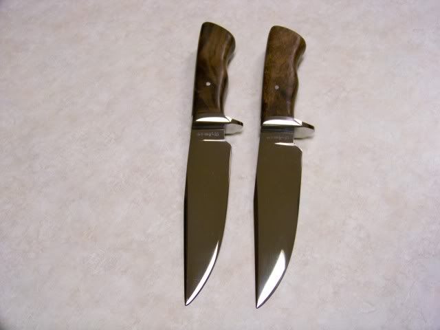
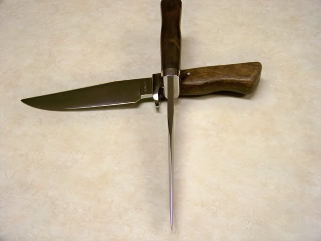
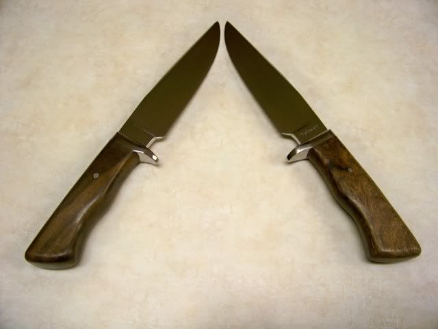
Thanks again for the advice Dana
Dana Holman
Apprentice Smith
Hey Dana -- Your knife crafting look very well done. Thank you for sharing this process of design exploration on this forum so other can learn too. This has helped improve my understanding. Of course, it's another thing to translate it all into body movements manipulating materials. I better get working. Thanks again! -- Phil
Hey Dana,
Thanks for the larger images. That helps a lot. I can see the palm swell now; you done good there.
Don't get too discouraged by the critique of your knives. You really do have a couple of nice looking pieces here. Finding something about them to change is pretty much nit-picking. I'm trying to look at your knives and see what it is about them that you perceive to be unattractive. But, my likes in design can be very much different than others. I'm sure there are plenty of folks who would not care for the design of the knife that I attached to this thread.
Nit-picking further on the knives in the larger images………… <img src=' http://www.americanbladesmith.com/ipboard/public/style_emoticons//wink.gi f' class='bbc_emoticon' alt=';)' /> I feel that the bottoms of the handles look a bit broad. Part of why they appear that way is because the bottoms are too close to 90 degrees to the sides of the handles. It gives the appearance that the handle was sawn from dimensional material, then the saw marks were sanded off and it was left at that. If you contour the sides of the handles thinner towards the bottom, or radius the bottom of the handle up into the sides, it would mitigate some of this effect. You could also grind the round wheel cut behind the palm swell deeper at the bottom of the handle, or even take it all of the way under the handle and across to the other side.
This is rather difficult to explain and I hope I haven't confused you. But basically, I'm saying that you should avoid having your handles, or any of your fittings, look like they were just cut from dimensional material. Avoid surfaces that are 90 degrees to each other. Create contours, radiused surfaces and flowing lines.
Most of the things that I have suggested could still be done to the two knives; if you feel that it would correct what you perceive to be wrong with them. Don't be afraid to go after them with the grinder. I suggest that you get a piece of pine lumber and practice shaping it like you wish to reshape these handles. Once you get the feel for how to go about it, then work on the knives.
When working out a new handle design, I often grind the shape out of pine first so I can figure out how to go about it. This too allows me to feel the handle shape in my hand to see if I like it. I will then keep the pine pattern to refer back to. If the shape is complicated and I have used different sizes of round wheels to grind it, I write on the pattern what size of wheel was used to cut each contour.
Thanks Phil, I'm just trying to figure out how to better my work and hope others find something in here to help them too.
Steve, thanks for the advice, the pine handle is a good idea, I've been afraid of taking off to much and then have to redo the hole handle. I see your point about the bottom of the handle, these knives were going to be delieved tomorrow but I may wait.
Thanks again for the help
Dana
Dana Holman
Apprentice Smith
these knives were going to be delieved tomorrow but I may wait.
I hope you didn't think I was saying that the knives were not fit to sell. I was nit-picking your knives to help you train your eye and to encourage you to try to go further with your work. I have to be honest and say that when I started making knives, I sold knives that weren't nearly as pretty as your two.
Ultimately, the decision is yours about what you are satisfied with selling to a customer. If you and the customer are happy with the knives, then no one else's opinion should matter. But, you also want to be happy with the knives when you see them again in ten years. I have some knives out there that I wish I could get back and bury in a hole somewhere. <img src=' http://www.americanbladesmith.com/ipboard/public/style_emoticons//sad.gi f' class='bbc_emoticon' alt=':(' />
