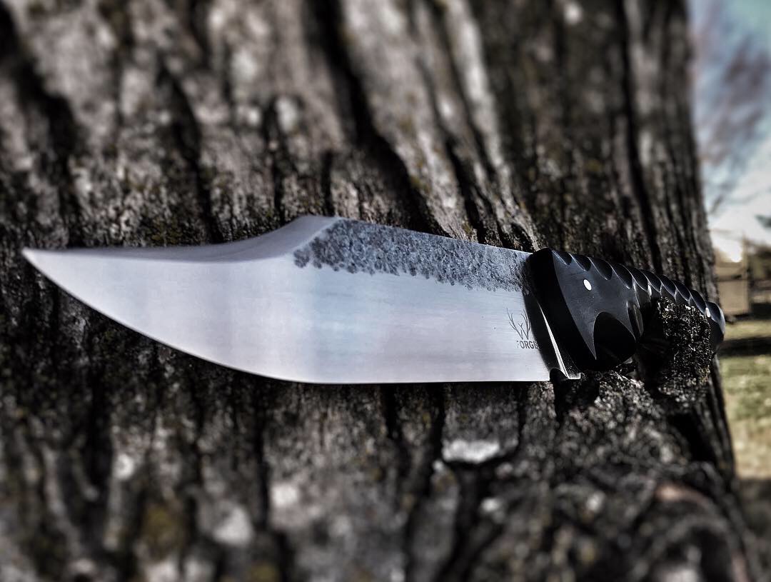
A few more pics of specific areas would help people give a critique. Zoom in on some detailed areas, and show the back and belly. From these two photos, it looks OK, but it's difficult to give any specific comments. It does look like the pin placement is a little high on the handle and the three pins do not look evenly spaced. The finish looks clean, where the blade is finished, but I have never been a big fan of leaving a strip of forged finish. Just my personal taste. The bottom photo is a little fuzzy and it's a guess as to whether or not the finish is truly clean and even. It's very difficult to provide anything substantial in the way of critique from a photo on a computer.
Joshua States
www.dosgatosforge.com
https://www.youtube.com/channel/UCdJMFMqnbLYqv965xd64vYg
https://www.facebook.com/dos.gatos.71
Also on Instagram and Facebook as J.States Bladesmith
“So I'm lightin' out for the territory, ahead of the scared and the weak and the mean spirited, because Aunt Sally is fixin’ to adopt me and civilize me, and I can't stand it. I've been there before.â€
Very nice Josh, keep it up.
Nice looking blade Josh! The first bit of advice would be to resize your pictures a bit smaller if you could, less than 1000x1000 pixels. The other bit is the handle, while the cutouts and scallops on the handle may be the look nowadays for actual use they will eat your hand up. Think hot spots and blisters. In my opinion a smoother handle would be better. Blade looks fine.
Brion
Brion Tomberlin
Anvil Top Custom Knives
ABS Mastersmith
|quoted:
A few more pics of specific areas would help people give a critique. Zoom in on some detailed areas, and show the back and belly. From these two photos, it looks OK, but it's difficult to give any specific comments. It does look like the pin placement is a little high on the handle and the three pins do not look evenly spaced. The finish looks clean, where the blade is finished, but I have never been a big fan of leaving a strip of forged finish. Just my personal taste. The bottom photo is a little fuzzy and it's a guess as to whether or not the finish is truly clean and even. It's very difficult to provide anything substantial in the way of critique from a photo on a computer.
Thanks for looking and, agree without holding something its hard to get a good perspective
|quoted:
Very nice Josh, keep it up.
Thank you Dean
|quoted:
Nice looking blade Josh! The first bit of advice would be to resize your pictures a bit smaller if you could, less than 1000x1000 pixels. The other bit is the handle, while the cutouts and scallops on the handle may be the look nowadays for actual use they will eat your hand up. Think hot spots and blisters. In my opinion a smoother handle would be better. Blade looks fine.
Brion
Ahh good point, I originally had the handle smooth but, thought it looked kind of odd with the finish on the blade. Maybe something a bit less defined than the larger scallops would have been better. Thank you very much for the feedback


